

Product Designer // Customer Experience Team
Driving £5m+ growth for Nando’s e-commerce site & app.
The Brief
Improve Nando’s online ordering menu across 400+ UK & Ireland locations.
Key Metrics
Increase AOV
Reduce user friction in ordering
Surface promotions to align with business objectives
Double Diamond Framework
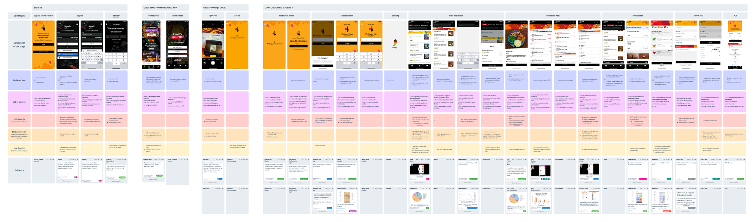
At Nando’s we worked to the Double Diamond framework. Through continuous discovery, user interviews, workshops, RITE (Rapid Iterative Testing and Evaluation) and AB testing on the live platform along with collaborating closely with engineers to ensure feasibility and fast shipping of any new ideas.

Discovery & Defining
I led qualitative & quantitative research alongside the Head of Research, Nicole Kelly and Product Manager Emily Byrne to understand users pain points across the online menu ordering journey, specifically focusing on the PDP.
50+ moderated/unmoderated user interviews
On-site interviews with customers at Nando’s restaurants across Leeds, London, Surrey
Hotjar surveys, heatmaps, heuristic analysis
Once completed, I synthesised the insights onto a User Journey Map, which helped understand what needed to be prioritised.
What did customers say?
“What is Rainbow Slaw?”
Nandos, London Kings Cross
“I don’t know what this side looks like, so I won’t try it”
Nandos, Leeds
“It’s overwhelming how much
I have to scroll”
Nandos, Guidlford
“I can’t find drinks”
Nandos, London Kings Cross
Developing & Designing
We engaged stakeholders and decided on key areas to focus on, moving forward with this HMW statement.
“How might we make the PDP more intuitive and engaging, to improve product find-ability so customers order more?”
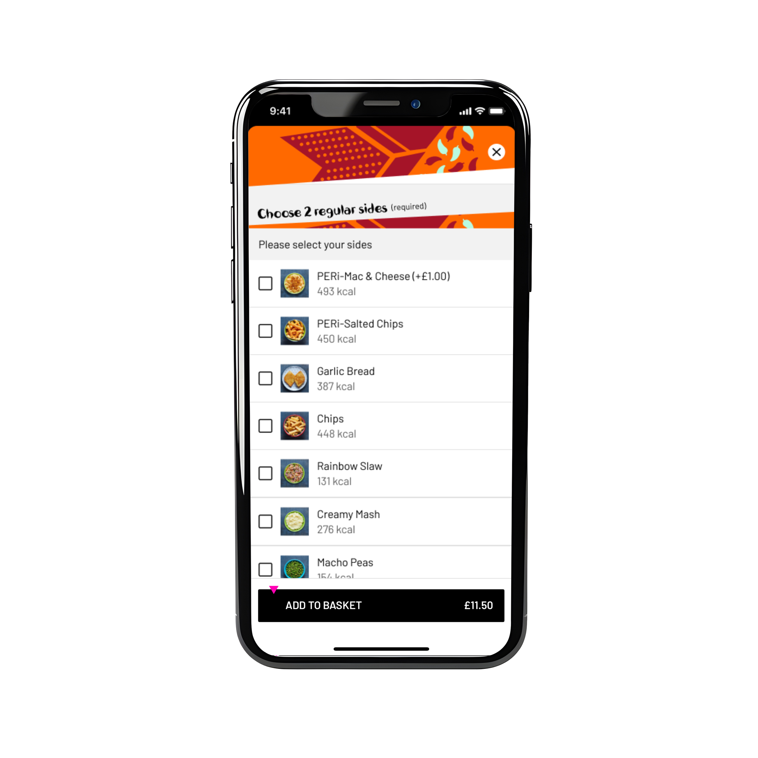
I added photography to the menu, with an est £490.6K+ per quarter
Insight:
Customers were unfamiliar with the different sides available on the menu, causing decision paralysis, drop off and leading customers to stick to ‘safe’ options like chips.
Hypothesis:
By adding side imagery to the PDP
Customers will find it easier to choose and add side options to their meal builder
Thereby increasing add to basket rate of +2 side bundles and reducing user overwhelm
Design constraints:
Limited dev capacity so need an easy to implement solution to test first iteration.
Limited photography, only ‘eat-in’ photography exists for sides.
Constraints around layout due to the existing pattern.
The smallest change on the menu can have big impact on user behaviour, so for this I wanted to ensure the way users interact with the UI doesn’t change.
Testing / Iterating:
RITE tested with 5 customers each iteration (to identify 85% of usability issues). The main issues highlighted from the tests were how users interacted with the image, often pressing it and expecting it to either select the item or enlarge it.
A/B tested on web across eat in, delivery and collect channels
Impact:
+£490.6K per quarter in revenue uplift for Eat In customers
(Note: we didn’t launch for Delivery users, where the photography performed worse - very strange i hear you cry! I would love to chat through in more detail in person!)
I designed a cross-sell feature for the menu & basket which projected £5m+ in revenue
Insight:
Customers stuggled to find items such as drinks or extras on the menu, often leading to either forgetting to add them, or returning from the Basket to the main menu.
Hypothesis:
By adding product recommendations on the ordering menu
Customers will find it easier to add relevant items to their basket
Thereby increasing add to basket rate
Design rationale for upsell feature
A list view of the cross-sell items reduces mental load as follows the same pattern used on the app.
Millers Law states an average person can hold 5-7 items in their working memory at one time.
Hicks Law states the more choices you present your users with, the longer it will take them to reach a decision, increasing cognitive load. Based on this 5 items will be presented to the user at one time.
Items are only added to basket when ‘Add to Basket’ is selected. Cross sell items add as a seperate SKU
Testing / Iterating:
Card sorting tests to map mental models around cross sell placement on the user journey
Usability tested multiple design variants
A/B tested for confidence in real-world performance and tweaked design based on negative impact
Impact:
Projected +£5M annual revenue uplift

I also worked on UI projects such as The World Football Campaign.
I was supplied the marketing campaign style guide, which i then applied to the menu to create a seamless visual experience that took customers from the social media campaign through to the menu ordering journey.

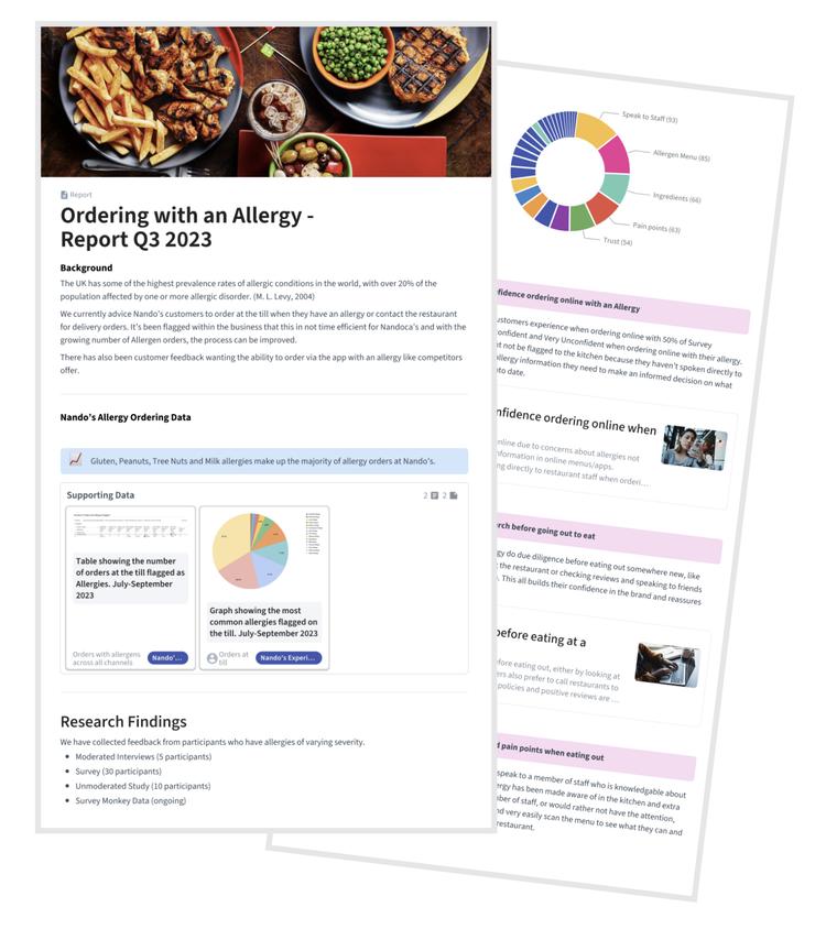
And large scale UX projects, such as redesigning the user journey for customers when they have allergies in restaurants.
I interviewed and surveyed over 100+ customers and non-customers and restaurant workers about their experiences when dealing with allergy orders. Once completed, I created a case study highlighting areas for improvement across the Nando’s allergy customer journey.
“Lucy showed up like a dream, for the customer experience, team and ability to work with stakeholders. Full of ideas, passion, drive and flexibility, able to find the balance between driving key business objectives and listening to the voice of the customer.
As the sole designer she worked effortlessly with the product manager, end to end, speaking to customers through quant research, to formulating AB tests and quant analysis, ideation and delivery. Showing personal qualities of insight, awareness and thoughtfulness of design.
She’s a much loved and respected by of our team. We still consider her as one of us and gladly welcome her back to rock her magic.”
Neil Macleod - Head of UX Design, Nandos UK & IRE